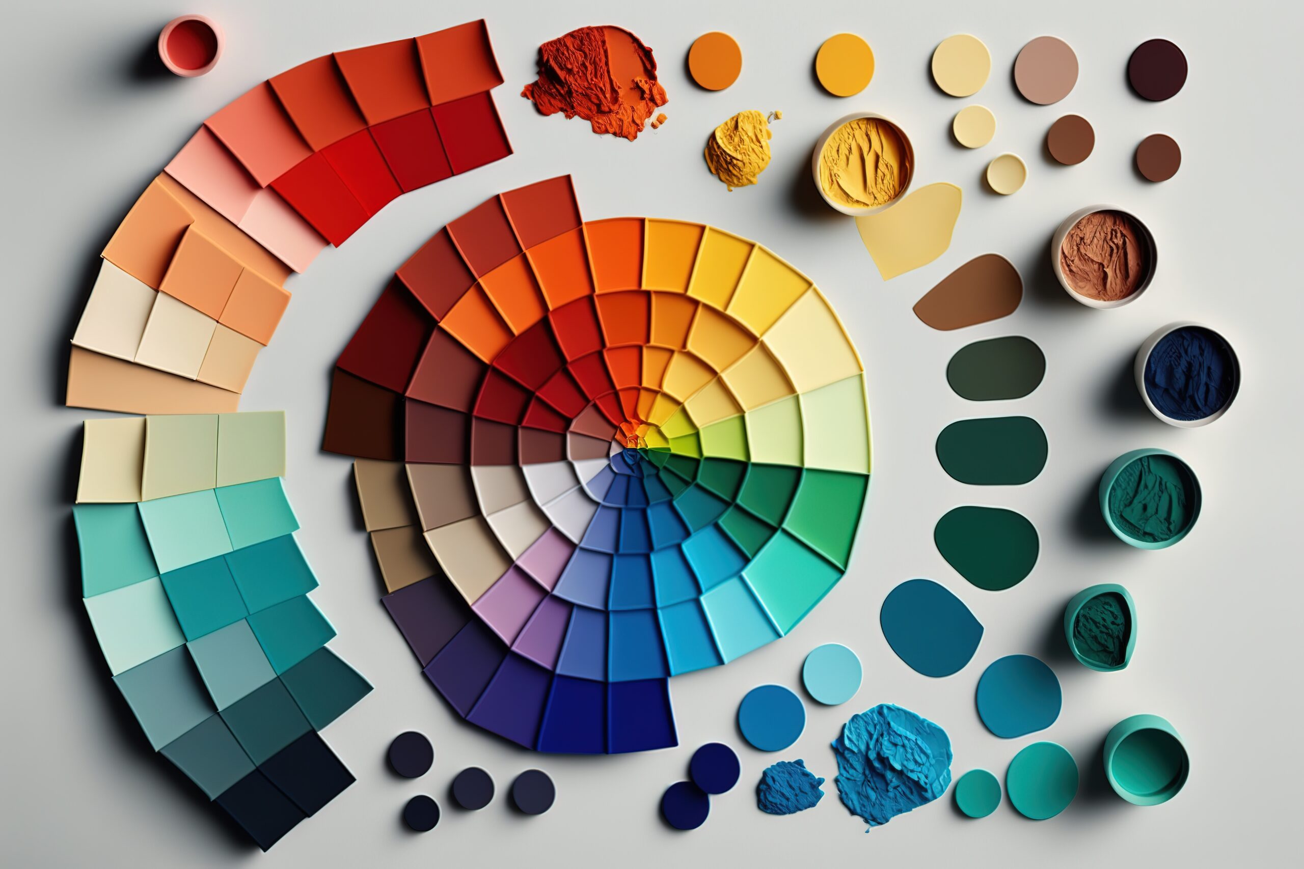
Color isn’t just an aesthetic choice; it has a powerful psychological impact that can influence our moods, emotions, and even behavior. Understanding how different colors affect us can be incredibly helpful when choosing the perfect paint for your home, office, or even branding materials.
Mood and Environment:
- Reds: Energetic, passionate, stimulating. Use sparingly in high-traffic areas like kitchens or gyms, as it can be overstimulating.
- Yellows: Optimistic, cheerful, creative. Ideal for kitchens, playrooms, or home offices for a boost of energy and mood.
- Blues: Calming, relaxing, trustworthy. Perfect for bedrooms, living rooms, or meditation spaces to create a sense of serenity.
- Greens: Natural, harmonious, growth-oriented. A versatile choice for living rooms, bedrooms, or offices,promoting balance and peace.
- Purples: Luxurious, creative, mysterious. Use in moderation in home theaters, bedrooms, or accent walls for a touch of sophistication.
Branding and Identity:
- Red: Associated with excitement, boldness, and action. Ideal for brands promoting energy drinks, fast food, or sports equipment.
- Yellow: Represents optimism, friendliness, and approachability. A good choice for children’s brands,educational platforms, or travel agencies.
- Blue: Signifies trust, reliability, and security. Used by financial institutions, technology companies, or healthcare providers.
- Green: Conveys growth, sustainability, and eco-friendliness. Popular for organic brands, environmental organizations, or health and wellness products.
- Purple: Evokes luxury, creativity, and imagination. Used by beauty brands, high-end products, or art and design companies.
Additional Tips:
- Consider your target audience: Who are you trying to reach with your space or brand? What emotions do you want to evoke?
- Balance is key: Don’t overwhelm with too many colors. Use a dominant color with complementary accents for a cohesive look.
- Lighting plays a role: Natural and artificial light can affect how colors appear. Test paint samples in different lighting conditions.
- Don’t be afraid to experiment: There are no hard and fast rules! Trust your instincts and create a space or brand that reflects your unique personality or identity.
Remember, color is a powerful tool. By understanding its psychology and choosing wisely, you can create spaces and brands that resonate with your desired emotions and leave a lasting impression.